The South London Gallery pays tribute to the late Pope.L with his inaugural solo exhibition in a London institution. The retrospective delves into his influential work, grounded in philosophy and theater, exploring societal, political, and cultural themes while challenging norms in language, gender, race, economics, and community.
Pope.L’s (1955–2023) use of language is pivotal in his work. The exhibition title, Hospital, is derived from the Latin word “hospes,” meaning stranger or guest. The narrative remains intentionally ambiguous, combining personal and collective experiences.
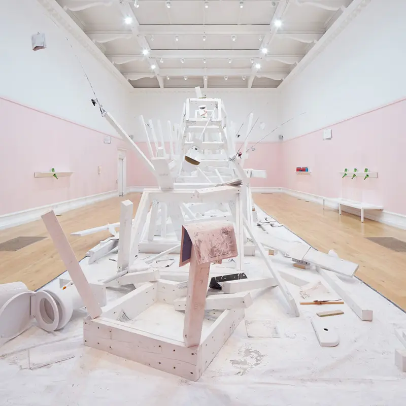
The exhibition features installations and interventions, including three large wooden towers in the Main Gallery. The three towering structures appear to crumble and collapse, accompanied by dramatic, uncontrollable sounds replicating the visual spectacle.
In the Fire Station’s entrance, dried marigolds serve as subtle yet powerful symbols of the connection between life and death, strategically placed to evoke contemplation. These flowers also appear in unexpected locations throughout the galleries, symbolizing defense against evil spirits in various cultures.
The exhibition also includes intriguing installations involving Buckfast bottles, filled with a sticky red liquid and placed in both the Main Gallery and the Fire Station. Pope.L incorporates the use of Buckfast, a tonic wine made by monks in Devon, due to its reputation for being marketed to young people. The pungent scent of alcohol, mixed with disinfectant, permeates the air, creating a sensory experience that blurs the lines between sterilization and consumable substances.
In the Fire Station, Pope.L’s “Space Between the Letter Drawings,” is displayed, where some canvases are deliberately absent, encouraging viewers to piece together the puzzle by locating the missing pieces scattered throughout the exhibition.
Outside the buildings, the traditional bright blue South London Gallery banners have been replaced by white sheets bearing a very pale pink cross, emphasizing the exhibition’s theme of “Hospital” and intriguingly challenging the conventional symbolism of a red cross.
Pope.L describes these spaces as sites where personal and institutional metaphors of care transform into scenes of spills, shelves with holes, fallen towers, broken bottles, and ongoing, unfinished elements, capturing the essence of “Hospital” as an experience akin to lying on a stretcher in a hallway, contemplating the ceiling’s veins.